If you’re trying to create a website for Personal Trainers, a gym, or any other fitness business, there is one key section that’s more important than all others.
This is particularly important if you’re trying to get more clients.
It’s the first thing a potential client sees when they land on your website. And first impressions matter!
It’s called the ‘above the fold’ section.
In the early days of print newspapers, the newspaper would be folded in half on a street corner or news agency. Potential buys would walk past and glance at the section they could see – ‘above the fold’.
This section of a newspaper has a bold, catchy headline, and a compelling picture.
The buyer would have a split second to process this information, and decide whether it was worth buying the paper.
Again, first impressions matter.
And it’s exactly the same if you’re creating a website for your fitness business.
The first thing a potential client sees when your website loads on their phone (usually) or computer (rarely) needs to tell them almost everything they need to know… without scrolling.
In fact, the ‘above the fold’ section should be a condensed version of the entire website – summarising the entire site in a sentence or two. Basically, if you removed everything on the website other than the ‘above the fold’ section, you should still be able to tell your potential clients 80% of everything they need to know.
So what should the ‘above the fold’ section include?
Here’s an easy template you can use.
[Business name] offers [USP], in [suburb].
[Summary of ‘how does the business work?’]
Scroll down to learn more, or leave your details here (link to webform at bottom of page, or, ideally, above the fold) to [offer/deal].
In this example, the USP is the unique selling proposition (the thing you’re best at, and do better than anyone else). The final sentence is a ‘call to action’, allowing the potential client to contact you.
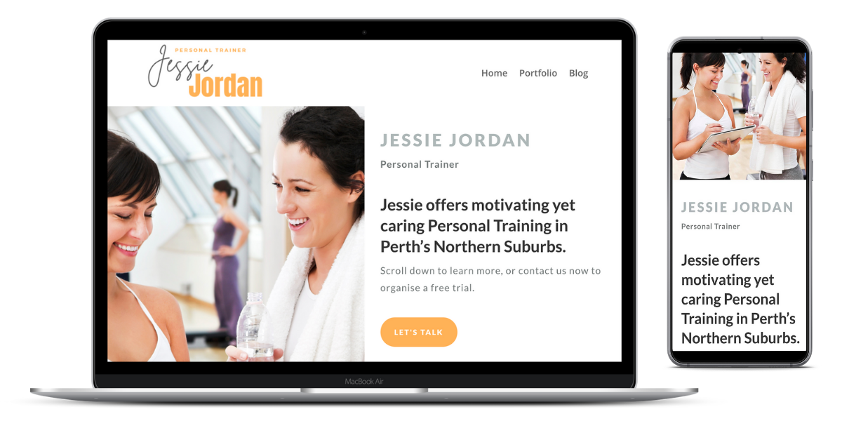
Here’s an example of what this would look like, from a website built by Range of Motion Fitness Websites. See if you can find each of the key elements from the template above.
Jessie Jordan offers motivating yet caring Personal Training in Perth’s Northern Suburbs.
Scroll down to learn more, or contact us now to organise a free trial.
Let’s break it down:
- Business name (In this case, it’s a PT’): ‘Jessie Jordan’.
- USP: ‘…motivating yet caring…’.
- Suburb: ‘Perth’s Northern Suburbs’.
- Summary of how does the business work: ‘Personal Training’.
- Call to action: ‘Scroll down to learn more, or contact us now to organise a free trial.’
You should accompany this text with a photo of your target client (your avatar), smiling, overcoming a pain point, while taking part in the key service offered by your business.
At the bottom of the page you can find an example of what the final ‘above the fold’ section looks like on a phone, and on a laptop.
You can find more examples in our portfolio of work.
Now open up your website. What does your potential client see? How can you improve it?


0 Comments