There are several elements of a fitness website that are absolutely imperative for a Fitness Business.
And by the same token, there are some things that shouldn’t be included.
Done well, a Fitness Business Website will act as a central hub for digital marketing, a place to build reputation through content creation, and a lead generating machine.
And it doesn’t need to be complicated.
In fact, a single page website is the best way to develop a highly effective online presence.
We’ve boiled it down to just seven key elements. Include these seven things (and no more) in your site and you’ll have built the perfect site for a Fitness Business.
For each of these seven elements, we’ve included screenshots of various websites we’ve built as part of ‘Range of Motion Fitness Websites’.
1) Above The Fold
In the early days of newspapers, the paper was folded in half on the news stand. Pedestrians walking past would glance at the visible part of the paper to see if it was worth buying. This ‘above the fold’ section of the paper with a compelling headline and image was the most important part of the paper when trying to make a sale.
With websites, the ‘above the fold’ section is just as important. When someone opens your website on their computer, phone or tablet, the information they see before scrolling is key.
In fact, the ‘above the fold’ section should be a summary of the entire website.
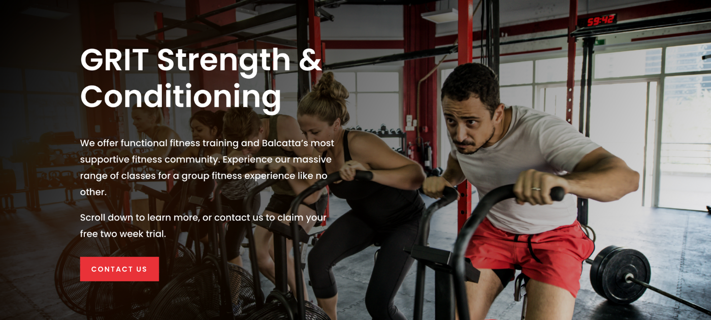
It should include the business name, the business’ unique selling proposition (USP), and the location (for brick-and-mortar businesses). There should be a summary of how the business works, and finally, a ‘call to action’ with either a form or a link allowing people to contact you or take the action you wish them to take.
Below, you can see a sample ‘above the fold’ Range of Motion Fitness Websites made for GRIT Strength and Conditioning.
2) Unique Selling Proposition
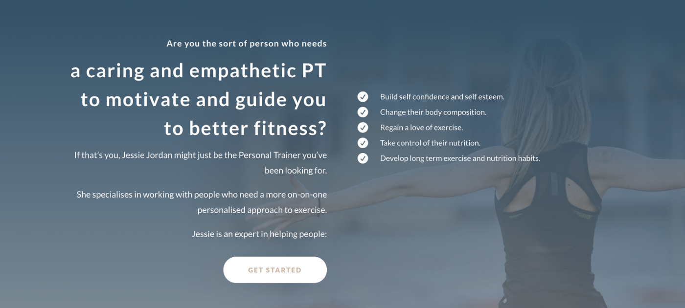
The first thing people should see ‘below the fold’ is the unique selling proposition of the business. The things it does best. What does your business do that no other can?
Below, you can see a sample ‘USP’ Range of Motion Fitness Websites made for Jessie Jordan Personal Trainer.
3) Avatar
The ‘avatar’ of a business is the ideal client, the target demographic. Think of your best client or member. Imagine if you had 5, 10, 20 or 1000 more of them (depending on the size of your business). That’s your avatar.
The biggest mistake we see Fitness Businesses make, is making their website ‘about them’, instead of about the customer. ‘About Me’ pages are outdated. They should be replaced with ‘About You’ pages.
On your website, define your avatar. Then, when they visit the site, they know your service is for them.
Below, you can see a sample ‘avatar description’ Range of Motion Fitness Websites made for 360 Yoga and Pilates.

4) Avatar’s Pain Points
Every business exists to solve a program. What is the problem your business solves?
Listing the problems your business specialises in solving will show your avatar that you can understand and empathise with their problems, and are best positioned to help solve them.
Below, you can see a sample ‘paint point solution’ Range of Motion Fitness Websites made for Fit For Life.

5) How The Business Works
We’ve covered ‘what’ you do best (USP and pain points), ‘who’ you help (avatar). Now we can talk about ‘how’.
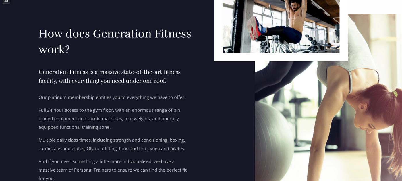
What is the product, service or experience that your Fitness Business offers? How do you solve the pain points of your avatar?
Below, you can see a sample ‘how the business works’ Range of Motion Fitness Websites made for Generation Fitness.
6) Social Proof
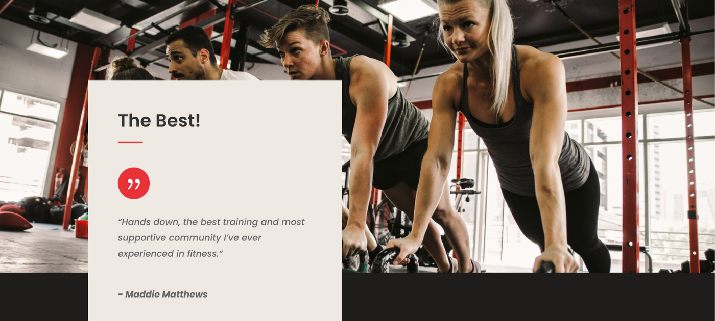
This is where you share testimonials or success stories. You want your avatar to see that people ‘just like them’ have had your help to solve problems ‘just like theirs’.
Below, you can see a sample ‘social proof’ Range of Motion Fitness Websites made for GRIT Strength and Conditioning.
7) Offer and Call to Action
Ultimately, the sole purpose of a Fitness Business Website is to cause your avatar to take action. This is where you do that.
In the majority of cases, this involves the person making contact with you in some way.
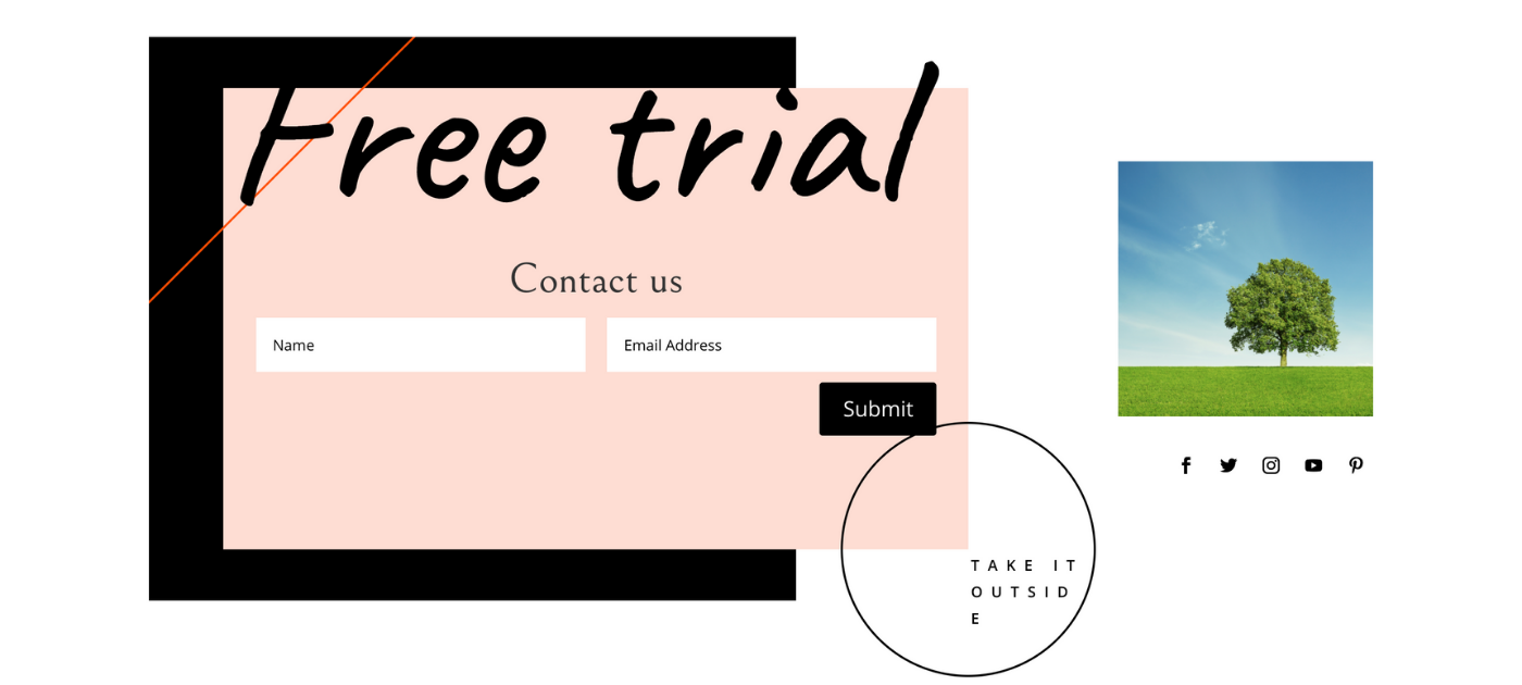
You need a compelling ‘reason’ or ‘offer’ for them to get in touch, then a simple, low-friction way (like a webform) for them to do just that.
Below, you can see a sample ‘offer and call to action’ Range of Motion Fitness Websites made for Expanse Bootcamps.
It’s that simple. Don’t overcomplicate your website. Tell your site visitors what you do differently, who you’re for, the problems you solve and how you solve them. Show them that you’ve solved problems of people just like them, and give them a reason to contact you and an easy way to get in touch.
To learn more about the work we do building websites for Fitness Businesses, head to ‘Range of Motion Fitness Websites’.



0 Comments